
The biggest priority for many kitchen renovators is to create a space that looks great now, but that also has lasting, broad appeal. This is in the hope that it will be less likely to “date”, and that it will add to their home’s resale value. But what are the key considerations for creating a kitchen with timeless style?
When you’re designing a new kitchen, it’s important to understand that “timeless” doesn’t have to mean “classic” or “traditional”. What really matters is that your kitchen aligns with the rest of your home, doesn’t move too boldly in any one design direction, and that it brings colours, materials, and accessories together in a balanced way. Whites and neutrals are the go-to base colours, but they still require careful and considered selection.
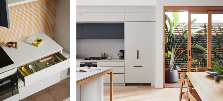
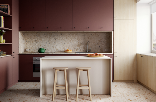
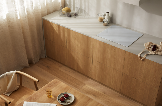
Left: Features Laminex Paper Bark (benchtop and cabinetry), Laminex Olivine (shadow line and internal cabinetry) and Laminex Kashmir Granite (right-hand joinery). Photographed by Derek Swalwell, styled by Natalie James. Right: Featuring Laminex Oyster Grey and Terril, both in AbsoluteMatte. Designed by Habitable Places, photographed by James Geer, styled by Natalie James, joinery by Kulija Kitchens.
White provides a neutral backdrop for your objects, art, and furniture, while creating a sense of space and maximising natural light. Its versatility makes it a great wall colour, creating cohesion between zones in open-plan living areas. A quick scan of the whites in the Laminex Colour Collection will reveal decors ranging from the clean and crisp Laminex Polar White, to the warmer White Linen or grey-based Ghostgum, with plenty of other options in between.
To select the right one for your space, it helps to understand how they’re made. Warm whites are typically created with the addition of a yellow undertone, while cool whites are made with blue. Grey is added to make whites more neutral. The undertone of your preferred white is your guide to complementary materials and textures. Classic whites lend themselves to Minerals, like those found in our Laminex TrueScale® range, which offer timeless and hardwearing benchtops with impressive no-repeat stone finishes. Warm whites and whites with subtle green undertones, on the other hand, pair perfectly with the timber decors in our TrueScale™ Woodgrains collection, creating warm, harmonious spaces with a touch of the outdoors.
Start by identifying the undertone of your preferred white and choosing the materials best suited to its character. This works both ways, too—if you’ve already chosen a benchtop or flooring material, look for white laminates and paints with a similar undertone.
Explore Laminex Whites
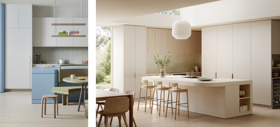
Left: Features Laminex Surf (cabinetry), Laminex Just Blue (island and pillar) and Laminex Olivine (booth and table). Photographed by Derek Swalwell, styling by Natalie James. Right: Features Laminex White Linen (island), Laminex Paper Bark AbsoluteMatte (cabinetry), Laminex Calm Oak (left-back cabinetry), and Laminex Premio Carrara TrueScale (splashback).
If whites aren’t for you, but the idea of beige also doesn’t quite sit right, it's time to consider a more neutral-based palette. Our mid-tone neutrals subtly convey colour and nuance without dominating or dating your kitchen.
Consider muted greens and gentle greys—colours like Laminex Moleskin, Paper Bark or Oyster Grey—and enjoy their ability to bring the calming influence of nature to your space. These can be paired with rich Woodgrain decors to enhance the connection to the outdoors, while cooler tones can work well with Mineral decors, to create a sense of consistency and sophistication.
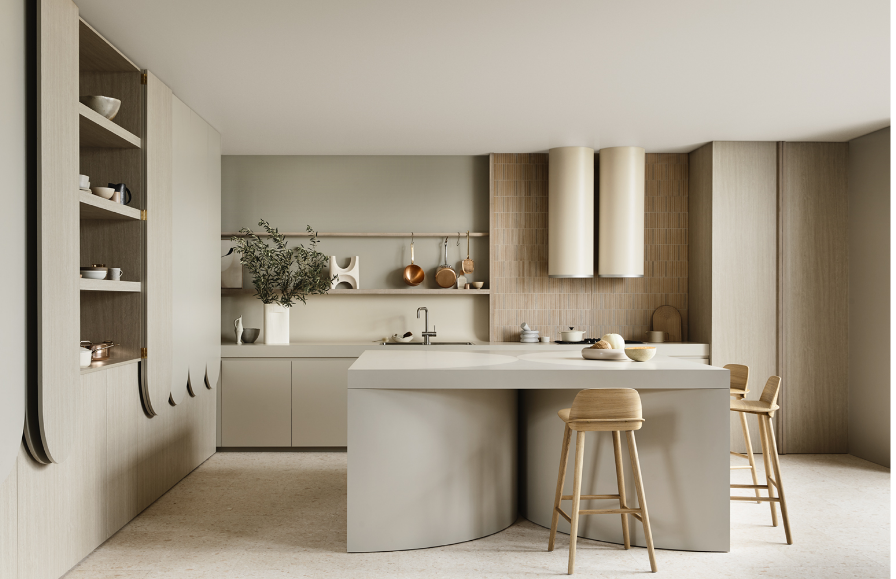
Pictured: Features Laminex French Cream (island), Laminex Paper Bark (island, left-hand cabinetry and back cabinetry), Laminex Whitewashed Oak (left-hand lower cabinetry & internals, back-right cabinetry). Designed by Kennedy Nolan, photographed by Derek Swalwell, Styled by Natalie James.
Pushing the idea of neutrals into new and exciting spaces, dark-tone neutrals can be used to deliver kitchens with strong, emotive aesthetics. These decors apply similar concepts as mid-tone neutrals, offering various undertones from warm to cool, but with deeper, richer colours. These are designed to enhance the potential for greater contrast with moodier results.
Laminex Stormcloud, a deep grey with a warm base, works perfectly alongside darker timber decors like Midnight Oak TrueScale™, for an effective and more uniform look and feel. Other dark-tones neutrals like Laminex Terril, which offers a deep, rich grey, create striking and unique kitchens that are no less practical or timeless—paired with light neutrals like Laminex Oyster Grey, these tones create a sophisticated palette that balances contrast with consistency.
Explore Laminex Neutrals
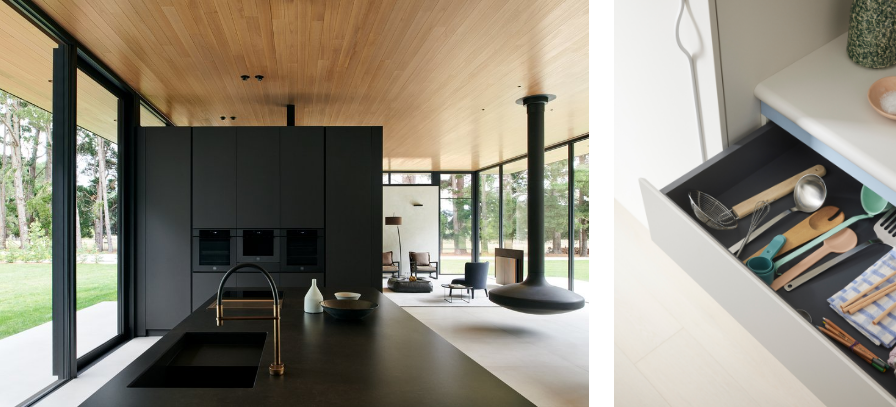
Left: Featuring Laminex Black AbsoluteMatte. Designed by SoS Architects and Studio Tom, photographed by Nicole England. Right: Features Laminex Surf (benchtop and cabinetry), Laminex Just Blue (shadow line) and Laminex Terril (internal cabinetry). Photographed by Derek Swalwell, styling by Natalie James.
Achieving an enduring look doesn’t mean we should forget what a little colour can do for your space. Designing a balanced kitchen with colours such as Laminex Bayleaf, Kalamata or Green Slate proves that a timeless kitchen doesn’t have to be plain, pale or predictable to be a success.
Colours in the Laminex Accents range can accentuate the details and features of textural decors, working in harmony with Laminex Whites and Neutrals, as well as with our Woodgrains and Minerals ranges.
When choosing appliances and fittings, simplicity is the safest strategy. Integrated appliances that can be concealed within cabinetry will achieve a professional, uncluttered look, while tapware and handles should utilise your kitchen’s theme and undertones for design coherence. Stovetops and ovens are available in multiple colours, metals, and finishes, so be sure to make your decision based on the palette of your kitchen.
The importance of storage can never be stressed enough, but striking the balance between aesthetics and practicality is equally so. Think about accessibility and ease, purpose and frequency of use when designing your space.
Feature lighting can really make a kitchen sing, and have a substantial impact on the look and feel of the space. Choose harmonious and consistent lighting options for timeless results, but don’t forget that a kitchen is not only a place to cook, but also to work, study, eat, and gather. Adaptable and functional lighting is essential for this space, no matter how you’re using it.
Above all else, take the time to make sure everything works together, in form, colour, texture, and style. The bottom line? Trends will come and go, but harmony will always be timeless.
Banner image features Laminex Calm White (cabinetry) and Laminex Calacatta Majore TrueScale™ (island and benchtop).
We recommend you take a closer look at your options, and experience the differences first hand, before you commit to a palette or design direction. Visit one of our showrooms to explore the range in person or order a free sample from the Laminex website to view your options in the comfort of your home.
Find Your Nearest Showroom Order Samples
You might also like