
Interior designer and trend forecaster Bree Leech provides practical insights into the trend, with inspiration from Laminex’s range of contemporary neutral decors.
Bright whites are no longer the default neutral in contemporary interiors. In their place is a range of warmer, richer tones that can support other colours and textures in a material palette while also having enough character to be heroes in their own right. Interior designer and trend forecaster Bree Leech has watched these ‘new neutrals’ emerge over recent years, and has a clear opinion on why they’ve become so prominent. “It’s at least partially due to our ever-increasing digital interactions, both at work and in our social lives,” she says. “Our response has been this need for more tactile surroundings and natural tones, as a way of reconnecting with nature.” According to Leech, this trend has seen all neutrals, including whites, becoming warmer and generally more evocative of the natural world.
“A warmer white or neutral can create harmony in a space, by creating less contrast with other finishes, particularly natural materials or timber-look decors. The effect is calming, promotes wellness and can reduce the stress of our everyday lives.”
Bree Leech – Trend forecaster and interior designer
Beautiful case studies for neutral-toned inspiration
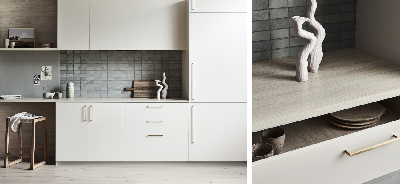
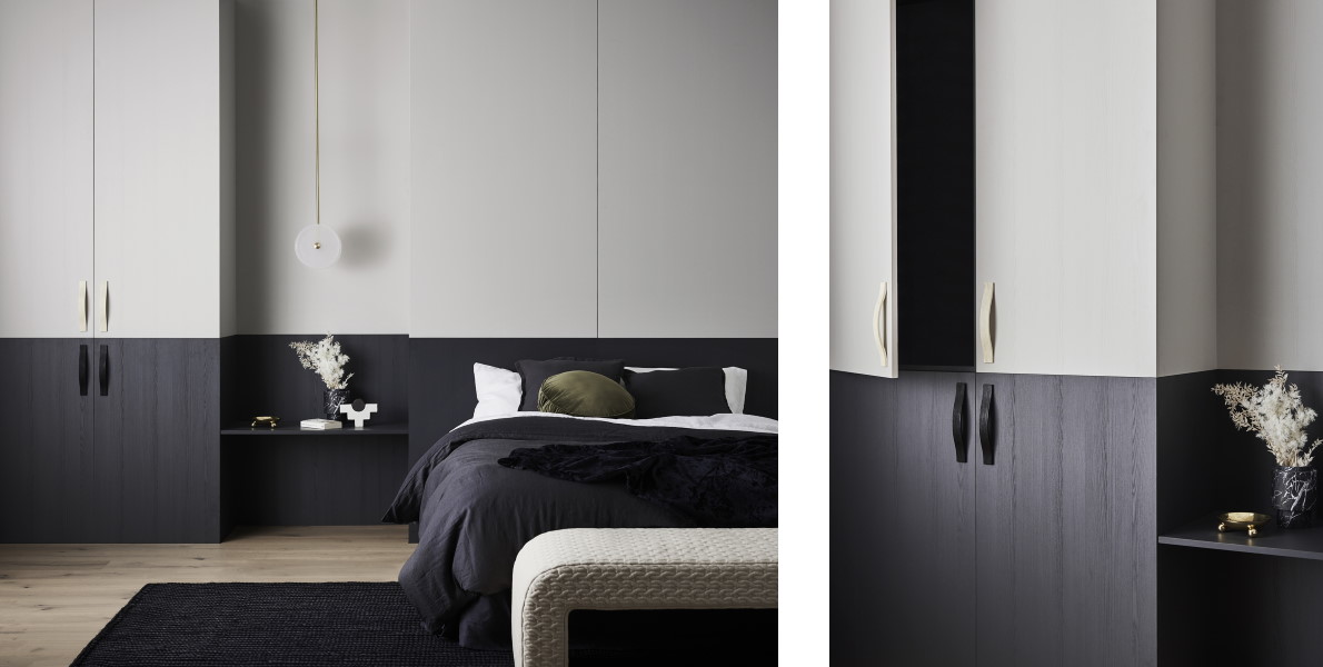
At Dan Gayfer Design’s EB House in Melbourne, the combination of rich Laminex French Cream and the honeyed woodgrain texture of Laminex Raw Birchply illustrates perfectly the calming effect of using warm neutrals with tonally similar materials. “The harmony of the two decors creates a casual mood that more contrasting finishes would not be able to achieve,” says Leech. And the introduction of the authentic woodgrain decor “brings elements of nature into the space and adds tactility.”
Order your free sample of Laminex French Cream here.
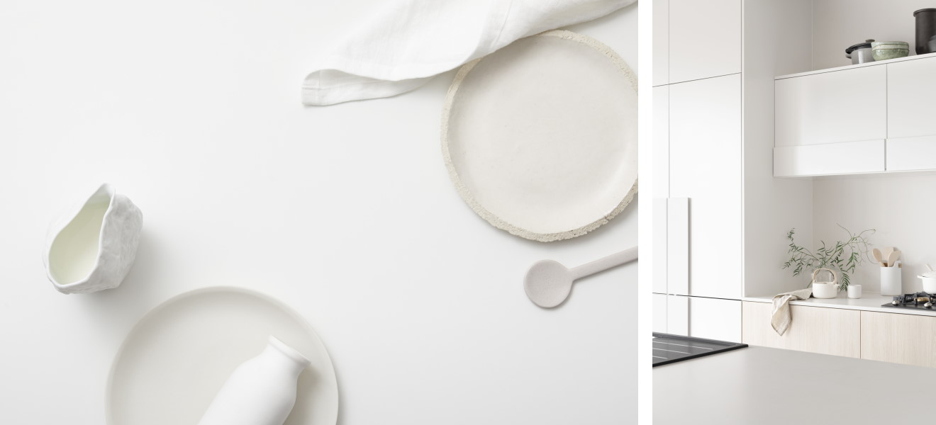
CJH Studio’s elegant Penthouse M on the Gold Coast is awash with so much natural light that a white interior might’ve been uncomfortably bright. The designers opted instead for a warm neutral palette built around Laminex AbsoluteMatte Raw Cotton, with the ultra-matte decor mitigating any glare.
Order your free sample of Laminex Raw Cotton here.
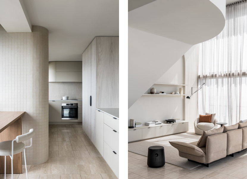
“Penthouse M is a beautiful example of elevating a design through simplicity,” observes Leech. “The restricted tonal colour palette creates a harmonious space, the matt surfaces soften the light and any embellishment is restrained. So each moment in the home creates a sense of calm via colour and simple form.”
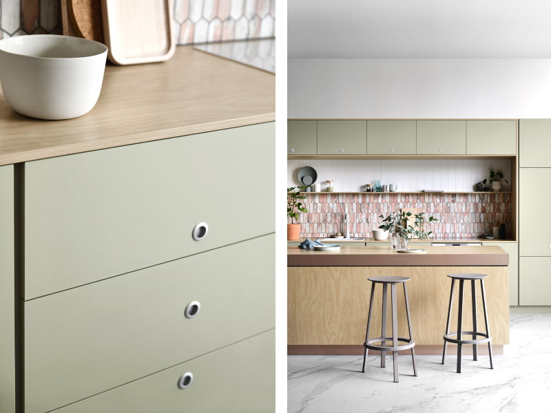
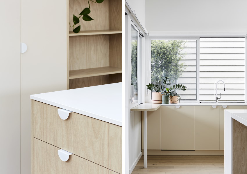
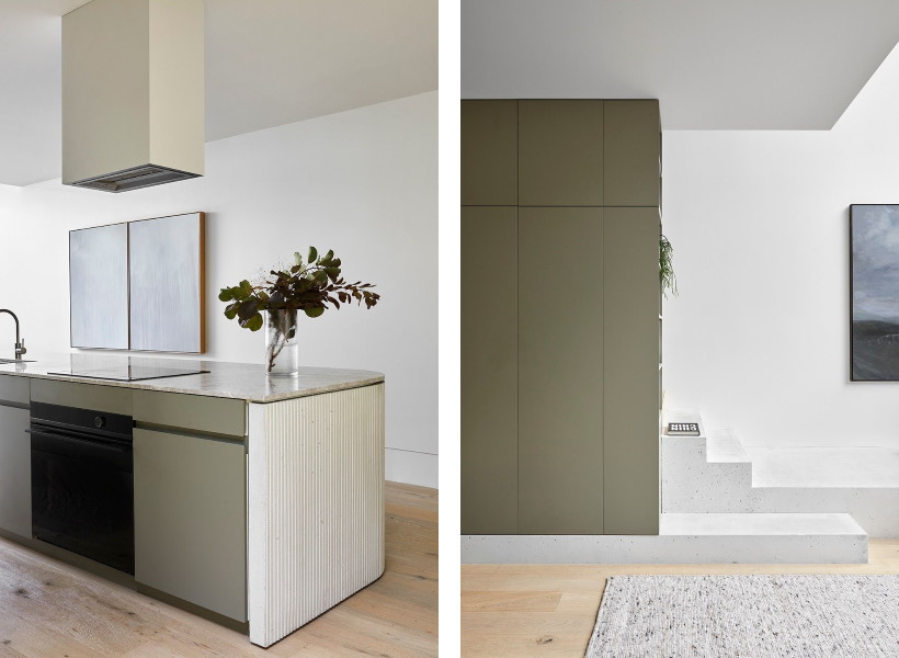
Leech’s own Country Kitchen project was designed to showcase Laminex AbsoluteMatte Surf. “We wanted to convey tactility and warmth, but also feel like the space was overall a neutral one,” Leech explains. “We balanced the Surf decor with natural green undertones in the wall finishes, adding the seemingly imperfect handmade texture of tiles and porous corkboard to make the kitchen feel less formal.”
Order your free sample of Laminex AbsoluteMatte Surf here.
“This trend doesn't just apply to joinery in residential projects, or to kitchens and bathrooms. We’re seeing workplaces and even more traditionally clinical spaces like doctors’ surgeries being designed with warm neutrals, to feel more like home.”
Bree Leech – Trend forecaster and interior designer

Three neutral Laminex decors perfect for the moment
With so many beautiful contemporary neutral decors in the Laminex Colour Collection, we asked Leech to pick three that she’s most looking forward to designing with. Her first choice was Laminex Oyster Grey in PureGrain finish. “Oyster Grey is a warm, calming grey that works back with other natural hues, particularly charcoals and browns. And the PureGrain finish is great for adding tactility to a space, with its subtle painted-woodgrain effect,” says Leech. “It's perfect for tonal colour palettes and creating a softness in an interior while adding a sense of luxury.”
Laminex Possum, another of Leech’s favourites, is instantly evocative of the Australian landscape. “Possum is a sophisticated take on brown, with undertones of green. It can create a fairly neutral colour scheme on its own and pairs beautifully with most types of timber,” says Leech. “It’ll also coordinate nicely with stone finishes with hints of brown in their patterning, to create a harmonious colour scheme.”
Leech’s third pick – soft, green-based grey Laminex Seed – is also inspired by the flora and fauna of the Australian bush. “Seed is the perfect complex neutral for harmonising with natural finishes and creating a sense of calm,” she says. “It can be used with other lighter neutral shades and whites with a green or yellow undertone. And it’s versatile – you can use it as the basis for a soft neutral palette or a more earthy scheme.”