Two recent and very different projects from Perth based multi-disciplinary design firm State of Kin show that they are no shrinking violets. While both draw on the firm’s knack for shape and colour, they serve very different purposes. One, a hair salon and Perth institution is transformed into a Post-Modern explosion of contrast and shine, and the second, a family home in seaside Marmion receives a complete rejuvenation befitting its past, with a foot confidently in the present.
“When we have fun, playful clients – which we often do - we go to Laminex,” says Ara Salomone, Director and Co-founder of State of Kin. “It’s always considered. Even when it’s bold and crazy, we just know that the colour range will work with stone or steel or any of the materials we know we’ll be working with.”
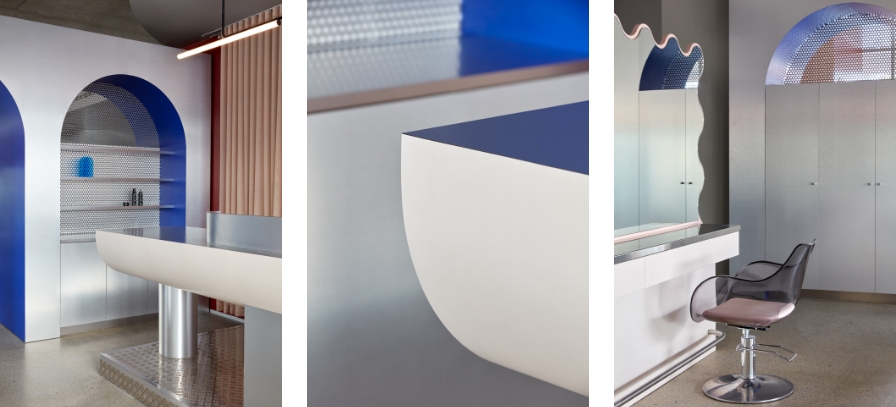
Take Circles of Hair, a very well-known entity in the Perth beauty and wellness scene. The task for State of Kin was to pay homage to the business while bringing it up to date with a look demanding of its bold personality. The final catch was that the salon was to remain operational throughout.
“We had to do it in 2 stages. We’d do the demolition, build half and move into that and then start on the other side. I think there was 2 weeks downtime for plumbing,” explains Salomone of the potentially problematic process.
From archways and tables to curvilinear plinths and details, circles dominate. There are S-pleated curtains and curved granite benches; nothing escapes its curvaceous touch, even the perforated steel continues the motif. A coffee machine in bright, Italian red arches its way towards the user. Fritz Hansen and Maletti Plexi Fume salon chairs beckon with their transparency and rounded forms.
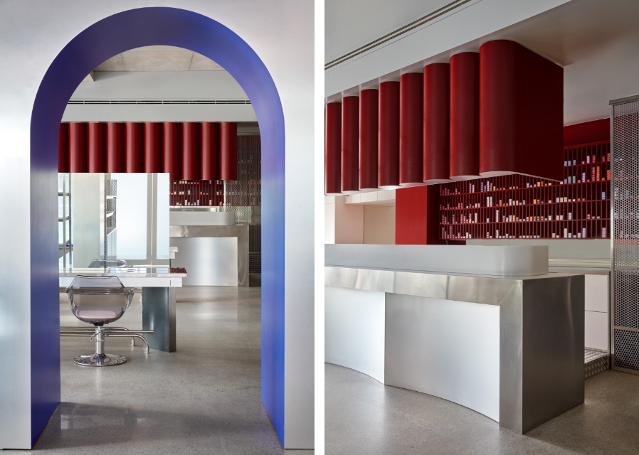

This is a salon worthy of Ettore Sottsass’s idiosyncratic Memphis Movement. Terrazzo and Kvadrat textiles tease as black and white granite enters the fray in a wonderful collision of textures, materials and colours. An abundance of surfaces shine, including the cabinetry in Laminex Aluminium Forte and Laminex Satin Smoke at the main counter.
Holding its own alongside chequer plate and perforated steel, a partition of wavy, Sottsassian curves cuts a striking line in Laminex Porcelain Blush, buying some privacy for those at the wash chairs. It counters the harder tones of the room balancing the palette, complementing the Laminex Kalamata and the Dulux Dublin Red of the walls in an ode to the avantgarde movement. But, perhaps most of all, it’s fun.
“On a job like this, everything has to be fit for purpose,” says Salomone, “so it was really useful to have all the products fall in line.”

The renovation and refurbishment of a family home may not have to make the same commercial considerations or take on the physical demands a busy salon might – but that doesn’t mean the results are any less striking.
Formally a classic Australian, two storey brick home, Playhouse’s original facade was typical of 70s and 80s homes. “It was quite literally the most standard 70s house you can think of,” remembers Salomone, “but it was built strong, a box with a hundred rooms inside and it had such good bones. We thought, if the footprint works, why are we demolishing it?”
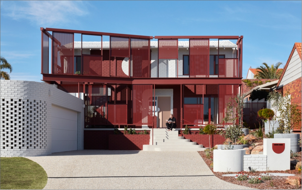

Playhouse is awash with colour, pattern and texture; there’s no mistaking it from the street. Perforated steel screens in burgundy dominate the exterior reaching above the old roofline and offer shade to the top floor bedrooms. The garage underwent a transformation of its own - given new life with a flat roof and curved wall in perforated white brick, there’s something of an architect’s nod to Modernism and gives the home real presence.
“The client was bold and able to make quick decisions on unique materials and colours, allowing us to be playful on this project, hence [the name] Playhouse” say Salomone. “It began with an obsession with travertine, and it gave us a base and something we could branch out of and into different products. With such a long list of colours and finishes, this meant we were able to maintain the balance and bring it all back to that first material.”
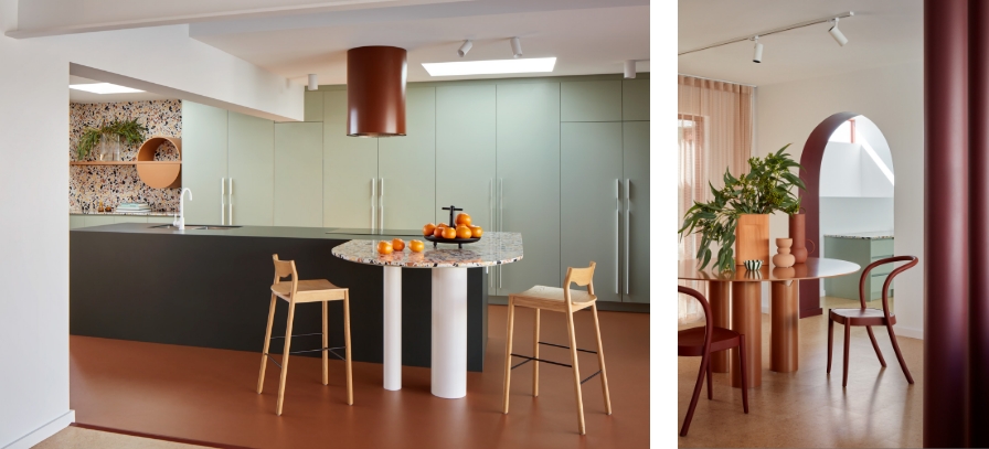

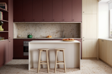
Step inside Playhouse and each room brings its own personality and story to tell, with a surprisingly controlled and composed outcome. There are familiar State of Kin signatures present of course; rooms are divided by archways, and mirrors, vanities and furniture all feature circles and curves, but this isn’t retail, and the terrazzo and granite are so effective because of State of Kin’s sympathetic colour blocking. In the kitchen, the soft green of Laminex Bayleaf occupies an entire wall of cabinetry, acting as tonal complement to the dark green benchtop and wonderfully paired Marmoleum Terracotta floor. This is a home that never shies away from the challenge, but “never turns into a cluster of crazy,” says Salomone with a laugh and a smile.
Pressed porcelain sinks in the bathrooms feel like oversized lollies, pressed out of musk Lifesavers rather than colourful clay. Formica Bluegrass and Laminex Just Lilac complement these elements perfectly, riffing on the terrazzo tiles while bringing their customary durability and resilience to the wet areas.
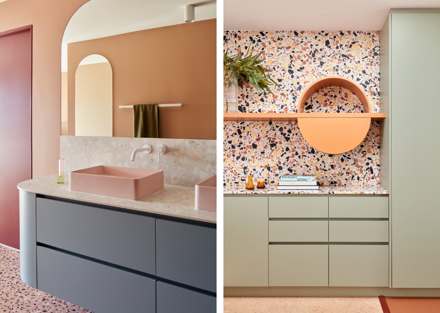

There’s so much at play here that there’s always the chance the final result could get lost, but by way of collaboration and the patronage of a willing and adventurous client, Playhouse feels holistic and complete. For some, the home may be too adventurous, but whatever your position, it demonstrates the importance of connecting the needs of a client with the thoughtful understanding of a project and its context.
Both Playhouse and Circles of Hair are perfect examples of these central goals, and are the epitome of rejuvenation, with both successfully meeting the functional requirements asked of them in playful and visually engaging ways. To experience these spaces is to be left with a smile and the warm feelings of a job well done, as well as admiration for the team at State of Kin, whose willingness to think outside the box brings such different yet spectacular projects to life.
Be inspired by these projects (and many more) on State of Kin’s website.
Photography: Jack Lovel


