With a name like Hellenic Homecoming, thoughts of panoramic vistas, blue seas that meet equally blue skies, and imperial-looking Doric columns are the first to come to mind. Wanting to reference the deep well of Greek architecture and influence, plus the client’s and her own shared heritage, Maria Danos Architecture made the connection, but did so without succumbing to pastiche, overwrought cliches or overused motifs.
Working intimately with the client, Danos established the themes and approach to the project, focusing on the tone and feel of the light in Greece. “We talked a lot about how we had visited Greece for the first time during our formative years, when we were young enough for it to make an impression on us, but old enough to really understand the differences between Greece and Australia,” says Danos.
“The light of Greece, the light on stone, in the colour and in its quality. It was how we saw stone for the first time and that it was a place of antiquity. So, we talked about how those first impressions could manifest themselves in the project, giving us the starting point for the palette.”
Specifying a beautiful Greek stone, Danos gave it varying finishes; a rusticated split face to reference the old world and a clean home finish for the new, letting the constant push-pull dialogue and meeting of the old and new worlds define the home. Neutral in tone, “as cool as it is warm,” the stone lends itself to either ends of the palette, but its main objective was to lighten and uplift the spaces, creating a light-filled sanctuary for three generations to live in together.
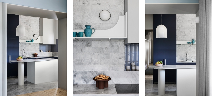

Connecting through food is something of a Mediterranean archetype and became a central focus for the home, explaining why opening and lightening up the living spaces was so important. Tables and benches received rounded finishes to encourage conversation and interaction, responding to the theme in a wonderful confluence of nostalgia and Danos’ consistent narrative. A home where the old world meets the new and Greek tradition meets modern design.
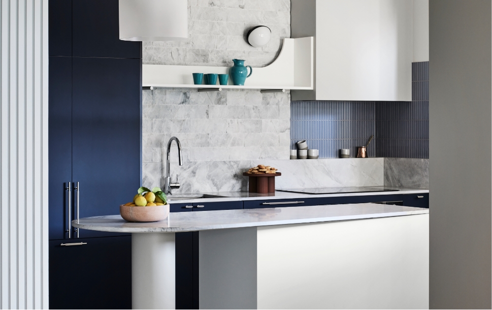
“Of course, we started looking at blues, but not the obvious blues that you might think about, but more restrained blues and that’s how we tied Laminex in too, with the gorgeous French Navy from the AbsoluteMatte range. It has a beautiful, almost velour feel to it. You feel like touching it. It has a velvet quality which makes it feel a lot richer and deeper. It became a very important part of the palette.”
More blues were added, their chalky and soft finishes not just in harmony with the colour palette but with the textures of the home too. The vertically placed mosaic tiles of the kitchen and bathroom splashbacks give a nod to antiquity and work perfectly alongside the Surround by Laminex Batten 25. Painted to match and complement the Laminex AbsoluteMatte, the wall linings pair splendidly with the colour and textural palette of the home.
“We looked at fluted profiles, that referenced the columns and textures of the homeland and we expressed that in the circular basins we found from a beautiful, local maker and in the profile of Batten 25. I had been doing that myself for years, but here we have a proprietary product with good sustainability credentials, easy for the carpenter to work with on site and an element that worked very well because it linked the old part of the house with the new.”
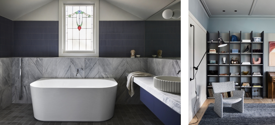

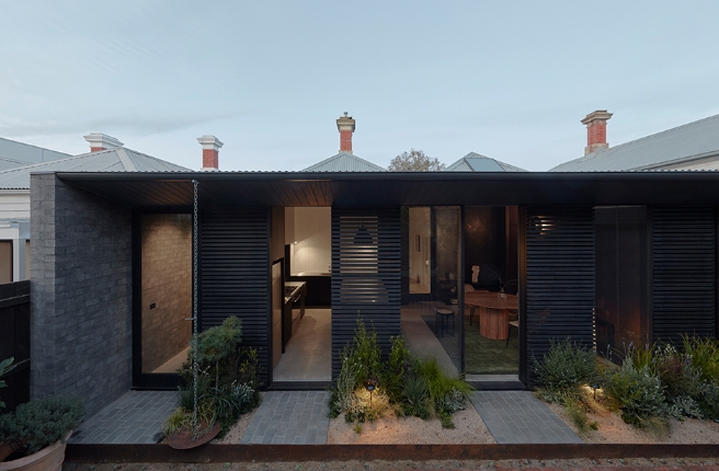
This project, at its core, is a bringing together of two historically varied spaces, moving the original Arts and Crafts home and its 90’s extension in line with each other. What was clear to all involved in the project was that the two eras and scale of the home worked well together and once completed, resulted in a home perfect for a multi-generational family. “I love working closely with our clients,” says Danos, “it’s a privileged role and this was small but very rewarding project,” she adds in reference to the personal elements and themes of the home.
Full of layers and meaning, Hellenic Homecoming is a demonstration of restraint and architectural experience, making reference to its source material via clever and considered details. “It took a lot of time to find the right blue, but it was successful in the execution, and of course that colour is a reference to those seamless blue horizons.”
Learn more about the project here, or explore Maria Danos Architecture’s full portfolio.
Credits:
Architecture: Maria Danos Architecture
Video: The Local Project
Photography: Sharyn Cairns
Build: Larik Constructions
Interior Design: Maria Danos Architecture
Styling: Maria Danos Architecture
Joinery: AB Symmetrix

