
With pastel tones featuring prominently in new commercial and residential interiors, we asked Alex Lake, Bree Leech and Matt Woods to tell us about recent projects where they've used pastels.
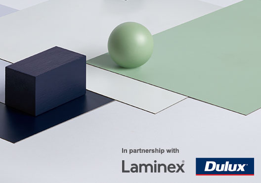
Pastel tones are being used to beautiful effect right now, from cafes, bars and retail fit-outs, to houses and apartments. As we reported previously, they had a strong presence at Milan Design Week. And it's a movement well supported by decors in the Laminex Colour Collection. Here, architect Alex Lake, designer Matt Woods, and designer and trends forecaster Bree Leech share some insight into how they've used pastels in recent interior design projects.
Alex Lake from Therefore
In launching a new coffee roasting company, our clients at Vacation wanted to reflect their slightly more relaxed attitude towards specialty coffee. In response to their brief, the branding agency TCYK developed a graphic identity that's colourful and bright. With this cafe being the flagship of the brand, the challenge was to integrate the identity back into the architecture. The pastel colour tones came out of the need to pair back or desaturate those purely bright colours, to harmonise them with other materials.
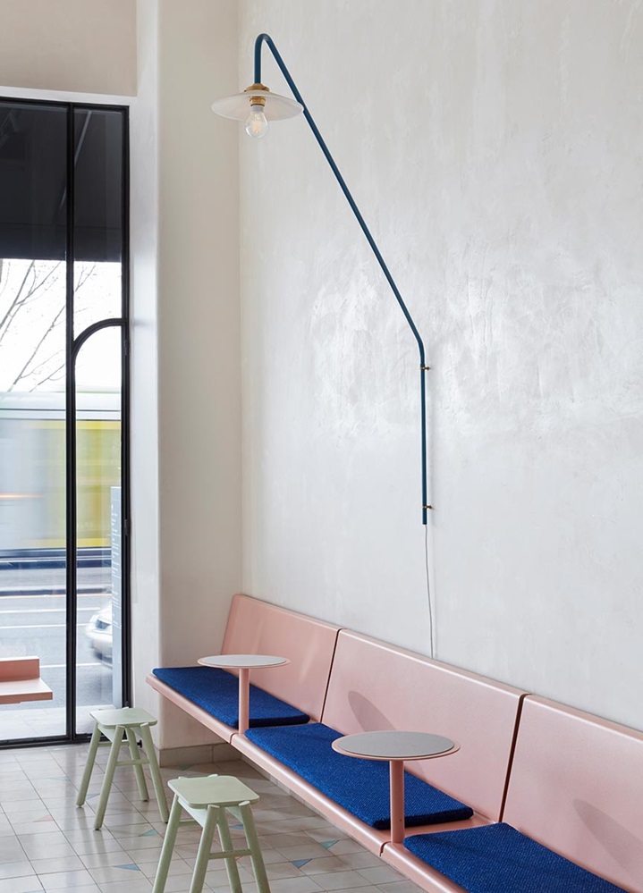
It's always challenging to coordinate colour across different products and finishes, particularly where colours are dictated by what the various suppliers offer. At Vacation the palette began with floor tiles in a custom pattern using three different colours, and a pink hammer-toned powder coat that we sourced from overseas.
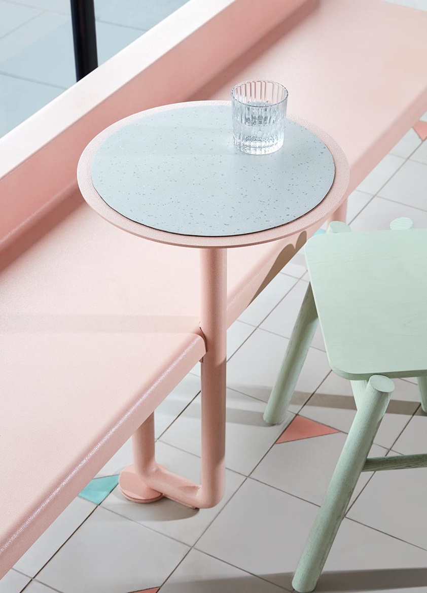
The dining chairs are from Italian furniture producer Mattiazzi in a soft pastel green, and we worked with local manufacturers to custom colour-match stools and a pendant light to that tone of green. Then for contrast, we introduced a bright blue wall lamp which paired well with the deeper blue powder coat seen on the cabinetry and upholstery fabric in cobalt blue.
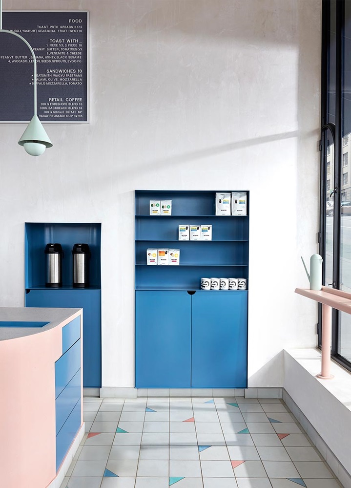
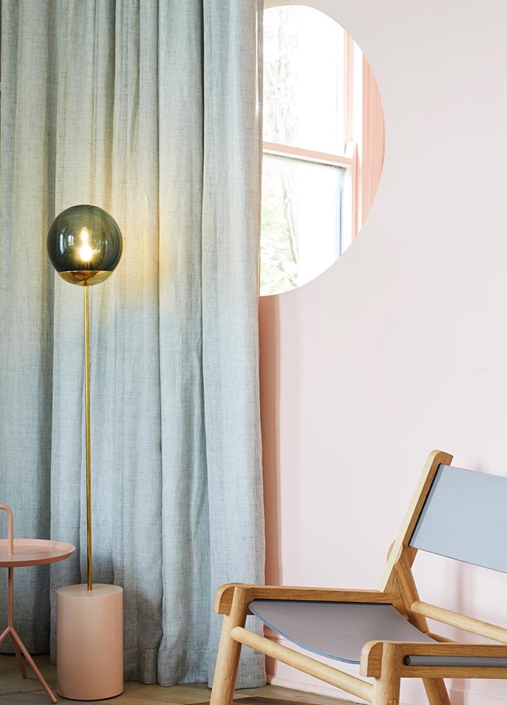
The café is in a tall tenancy in a heritage building and the specific pastels and textured finishes help to exaggerate the daylight within that space. The building shell itself is very much without colour and then the objects that sit within it are colourful, so there's a sense of play between architecture and furniture, which is something that we think about a lot. And more broadly, it's in a fairly mundane part of the CBD. The name Vacation has a direct analogy in the idea of being escapist or otherworldly, so to bring these pastel colours to the context of the city was certainly very considered.
Get the look
You can achieve this look with the Laminex Colour Collection.


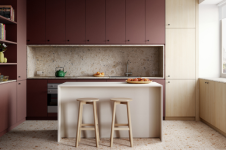
Bree Leech, designer and trends forecaster
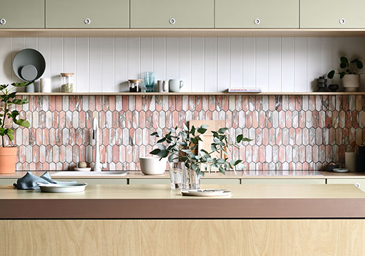
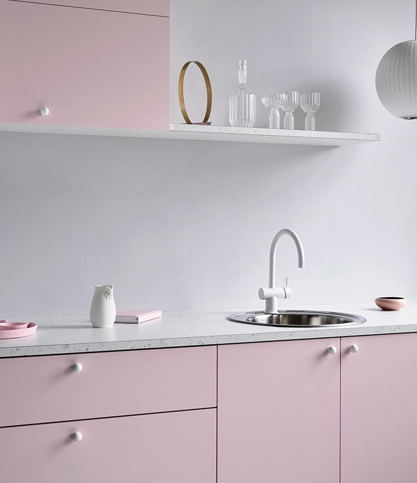
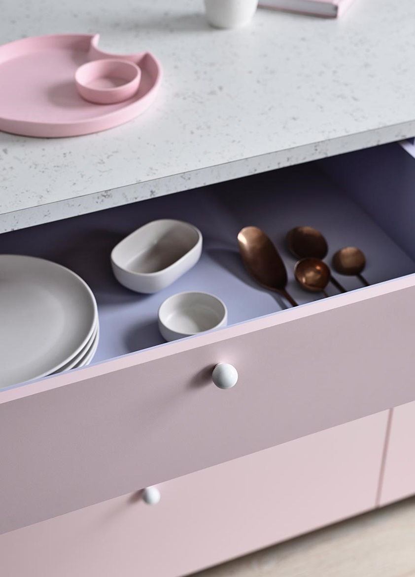
In designing this kitchen for Laminex, the idea was for it to be quite soft and feminine. We chose soft-pink Just Rose as the hero cabinetry decor, with internal cabinetry in Just Lilac, and the two colours work beautifully together.
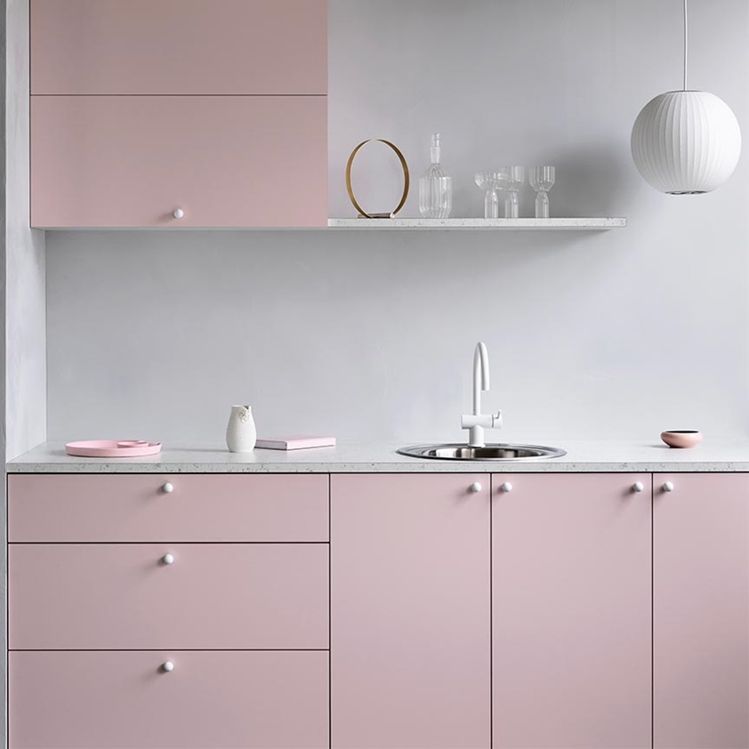
The rest of the textures were kept quite soft and powdery too, with a benchtop and floating shelf in stone-look Crema Venato, and the wall of the kitchen in polished-plaster-look Fresco by Porters Paints. We've got beautiful round glossy ceramic handles, like little clouds, from Linear Standard and a single white George Nelson pendant light hanging above from Lights Lights Lights.
Of course, you don't have to pair pastels with other pastels. They can be used as relief against stronger colour, especially in a tonal palette. So you might have a deep green, for instance, and then have a greyed-off pastel green tying back to it. Pastels do have a calming effect, they're very easy on the eye, and when you bring them together with pale colours like we have here, it creates quite a calming space.
I think that's one of the reasons we're seeing more pastel tones being used in interior design. Our lives are so hectic, we're constantly connected and we need relief or respite from that. What that relief looks like is different for everybody, but on the whole, people feel comforted by these softer colours, they create a sense of sanctuary.
That theory is supported by the kinds of pastels we're seeing now too. They're much more muted than the lolly-coloured pastels we've seen in the past. So pink will have a bit of brown in it, for instance, it's not fairy-floss pink. It's more earthy, I guess you could say, or more natural. So it's relating back to that trend of softness and subtlety and sanctuary.
Get the look
This kitchen was created using the latest decors from the Laminex Colour Collection.

Matt Woods from Killing Matt Woods
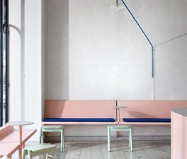
The Rooftop is a 70-person rooftop bar at the top of the Quarryman's Hotel in Pyrmont. It's a pub that you might call a bit of a beer den, and you typically see a very masculine crowd there. But on the top level there's an indoor area which is separated into a couple of different lounge rooms and a small outdoor deck, and the owners asked us to create an environment up there that would be more appealing to their potential female demographic.
The client's brief didn't explicitly ask for pastel colours to be used, it was more about having a Palm Springs-inspired rooftop. But that immediately got me thinking about Palm Springs architecture, and pastels are obviously a consistent feature throughout Palm Springs. And taking the theme further, we landed on a cactus theme on the deck as well. So all in all, it's very, very "Palm Springsy"!
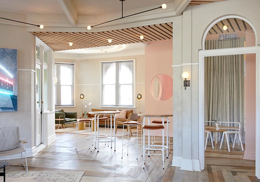
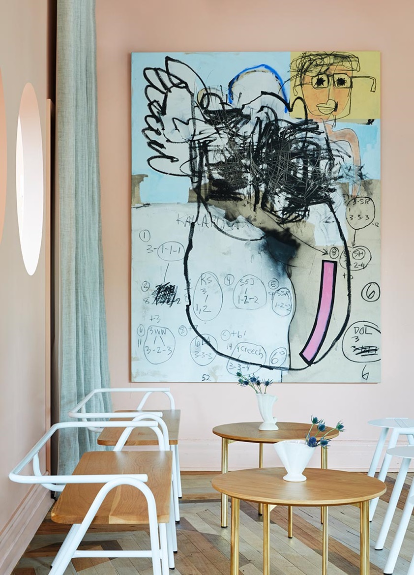
For the pastels, we used a variety of finishes. The pink corner is probably the most pastel-oriented part of the space, with a soft-pink paint finish by Porters Paints applied to the walls. We've matched that with a range of mid-century inspired furniture pieces, again in line with the Palm Springs theme. But while you can always stick with pastel tones in an interior like this, I think there's often a good opportunity to introduce some more "in your face" elements too. That was our thinking behind the artworks on the walls - they're really vibrant, dynamic, and the pastel walls provide a great backdrop and accentuate the stronger colours.
Personally, I like pastels and there's definitely been a bit of a trend for them of late, but they're not something I tend to go to a lot as a designer. For this project, however, choosing these softer colours was all about meeting the Palm Springs brief.
Laminex Accents and Metallics
Discover our collection of beautiful pastels, bold colours, sophisticated metallics and natural textures.


You might also be interested in these