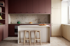
“There are some Laminex finishes we knew we had to use and the AbsoluteMatte finish as a texture is just beautiful. We ended up using Paper Bark and Otway AbsoluteMatte, but we were really excited to take some risks and be a little more experimental.” Mardi Doherty, Director, Studio Doherty.
The Scoop Kitchen by Studio Doherty is made up of a multitude of techniques, colours, finishes and surfaces, each incorporated seamlessly and effortlessly to create a kitchen of stunning versatility and quality.
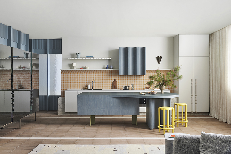
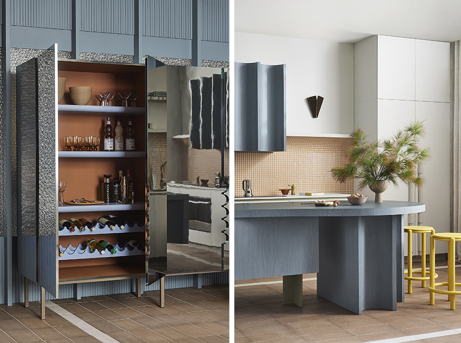
Studio Doherty found a theme in concave, circular motifs and applied them to the rangehood, kitchen island base and in smaller details like cut-out semi-circular handles and a wonderfully expressive mosaic-tiled splashback. Bringing cohesion and balance to the space, a characteristically bold, yet sophisticated palette ties it all together.
“We were really excited to explore the kitchen being a series of joinery pieces, of an almost furniture-like quality. So, we designed standalone pieces that had a beauty to them that wasn't just your traditional, rectangular block kitchen. We set about creating these elements that had their own personality and I think one of the things we were keen to do was encourage clients to use colour with neutrals and to push people to use Laminex colour; to not be too scared to pair it with colour.”
At the dining table end of the island, concave alcoves form a base of repeating, spirograph-like loops. Reinforcing the theme, it’s a striking detail, albeit one with a practical function; they provide a neat slot for the stools to call home.

Design with furniture in mind
Let your kitchen soar with furniture-like pieces that float off the ground and create paths for your eyes to meander and travel. Creating space in this way won’t affect your footprint or floorplan and will instead make your kitchen feel spacious and open. Detailing like feet and legs, handles and doors also become a great opportunity to let your personality shine.
“We love creating things that people haven't seen before. It can be quite a neutral kitchen, but then have this one incredible detail. We often do these out of metals or out of stone, but it was quite liberating to be using Laminex. To create these gorgeous pops of colour or interesting details.

Remember to complement
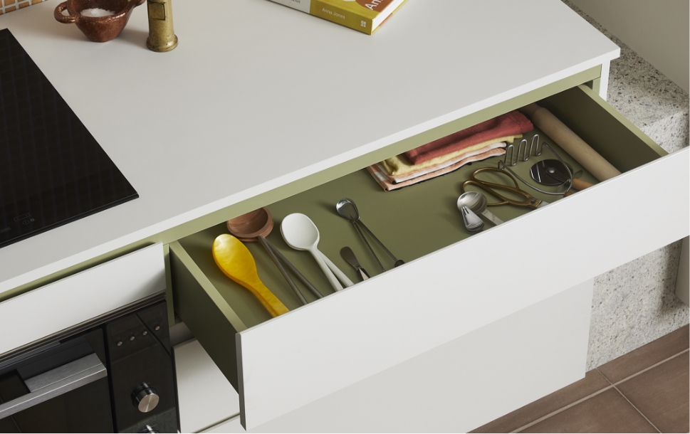
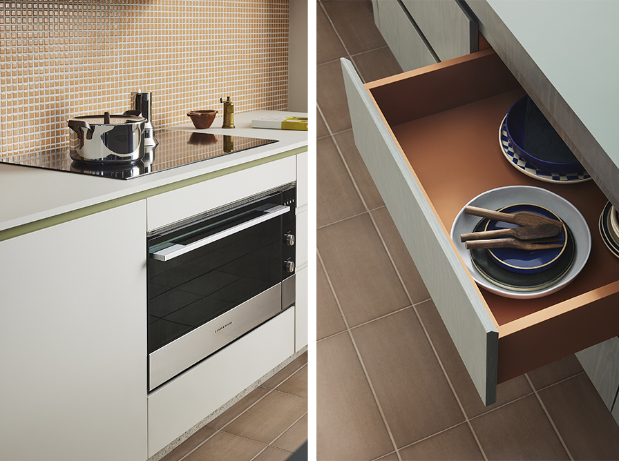
It’s easy to get lost in exciting palettes and crazy colours, but finding colours that complement your theme and allowing them to shine is the goal. In Scoop, drawer internals have been lined with Laminex Moroccan Clay and the bench top features a shadow line just between the drawers and facing. Subtly detailed in Laminex Olivine, it adds an element of surprise and a touch of luxury with Laminex’s built-in durability.

Don’t be afraid to contrast
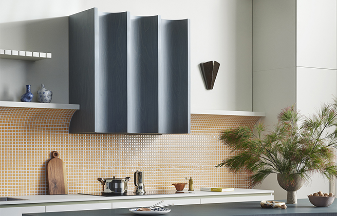
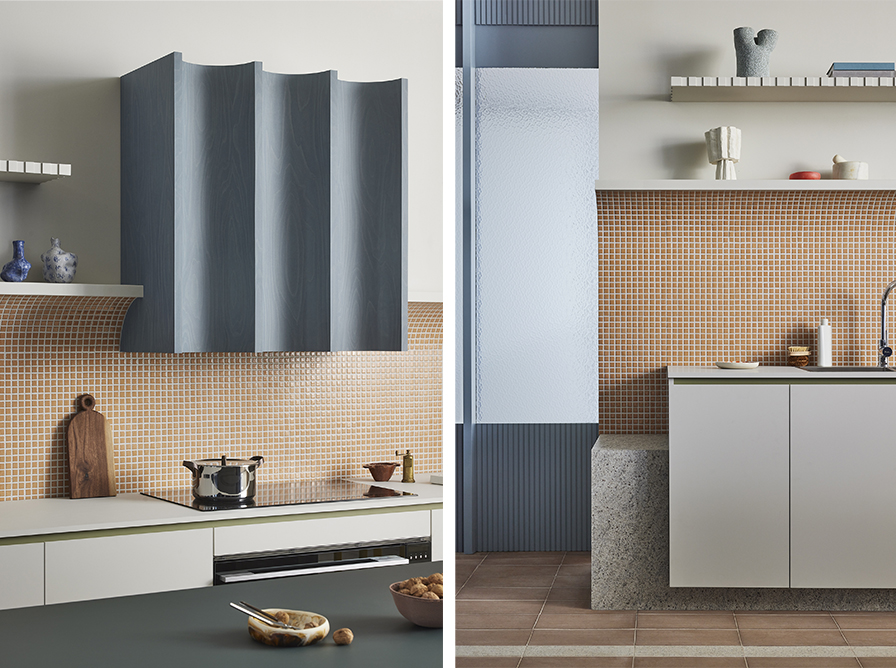
Studio Doherty finds beauty in juxtaposition and a splashback in glossy Wakei mosaic, soft orange tiles from Japan (Artedomus) makes the right statement. Arching upwards and into a practical shelf there is a hospitality user-friendliness to the design, but it’s the clashing joy it provides as it meets the Laminex Smoked Birchply rangehood in a seamless fusion of curves, lines and colour, as the meeting point of the kitchen’s theme .

Anchor your palette with a Neutral Base
Using whites and neutrals as its base, Scoop’s features all get their moment to shine. Laminex Paper Bark AbsoluteMatte, with mid-grey and soft green undertones, is the perfect accompaniment to Laminex Olivine and Laminex Smoked Birchply. Using a neutral such as this adds warmth and acts as an anchor and connection for the entire kitchen; each element able to find its way back to a central galvanising detail. It is also a reminder that if every surface is a feature, then nothing is. Neutrals live to complement, allowing the right qualities to come to the fore.
“Ultimately, it’s about establishing material and colour combinations that express individuality.”
Contributors
Campaign: Laminex
Design: Studio Doherty
Stylist: Natalie James
Art Direction: Ortolan
Joinery: Evolve Interiors
Tiled Floor and Splashback: Artedomus
Appliances: Fisher&Paykel
Featured in these designs
Back Bench
Laminex Paper Bark in AbsoluteMatte
Laminex Olivine
Laminex Kashmir Granite
Artedomus Wakei Mosaic Tile (curved splashback)
Surround by Laminex French Stripe 30 (shelf on wall)
Island Bench
Laminex Smoked Birchply in Chalk
Laminex Otway in AbsoluteMatte
Laminex Moroccan Clay
Rangehood
Laminex Smoked Birchply in Chalk
Pantry and Bar
Laminex Mirror Smoke
Laminex Peacock and Laminex Steel Blue (Pantry Side)
Laminex Moroccan Clay Laminex Steel Blue (Bar Side)
Floor Tiles
Artedomus Litos Tobacco
Fibonacci Khaki Jam (in-lay)
Screens
Surround by Laminex Batten 25 painted in Dulux Five Fingers Peninsula
Mottled glass
Styling items
Custom design Stools by Christopher Blank, Wall light by Sarah Nedovic, Sofa by Jardan, Rug by Halcyon Lake, Sidetable by New Volumes


