
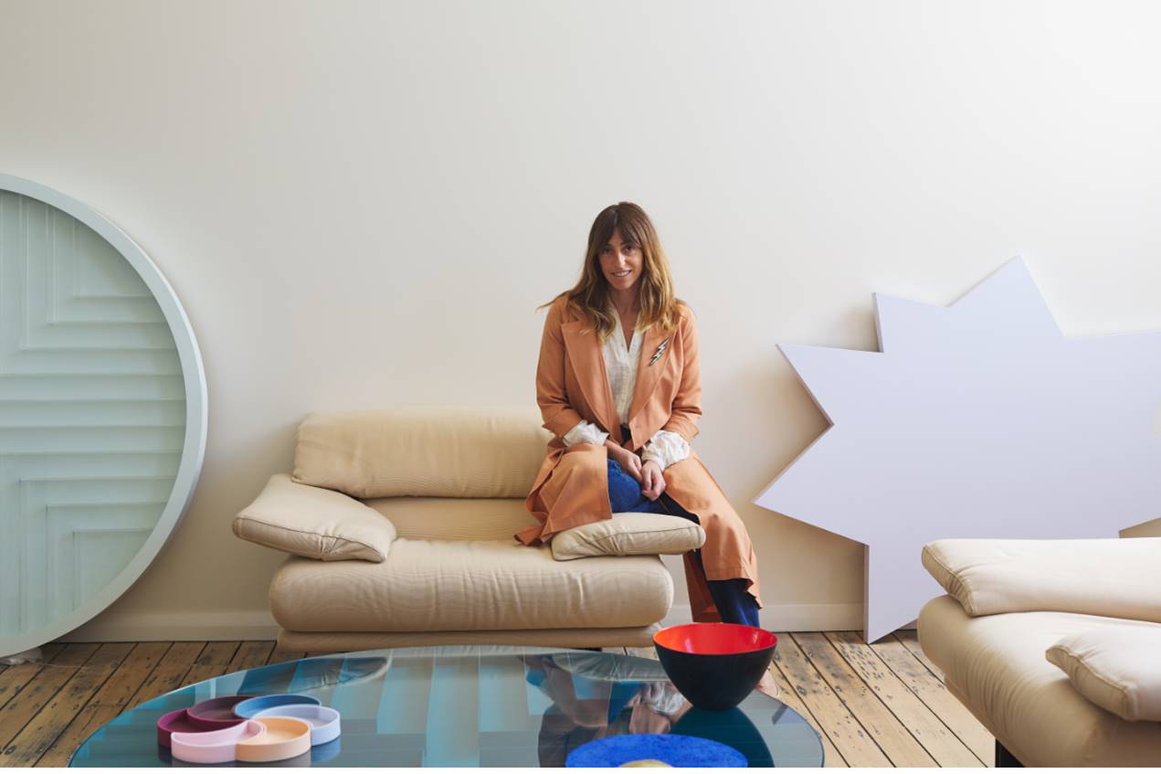
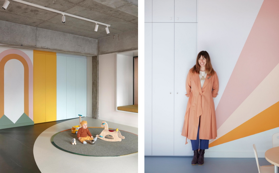
It’s enlightening to hear Danielle Brustman talk about her formative memories, growing up in houses that had been decorated in the 1960s and 70s, when heavily patterned, brightly coloured interiors were all the rage. She recalls details like her grandmother’s fantastic bathroom, resplendent with red tapware and blue tiles, and the orange kitchen benchtops of her childhood family home. “I’ve always been interested in colour and drawn to environments that feature colour,” she says. “I have a nostalgia for boldly hued interiors and that’s definitely driven my practice.”
Indeed, the Melbourne-based interior designer is now well known for her delicious use of colour, but also for an astute formal sensibility and a love of striking lighting. These characteristics come together in a vibrantly playful aesthetic that references those interiors of her early years while boasting a modern sophistication and polish that’s very of-the-moment.
Conceptual thinking leads to beautifully resolved spaces
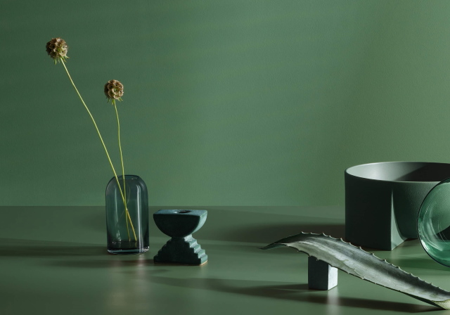
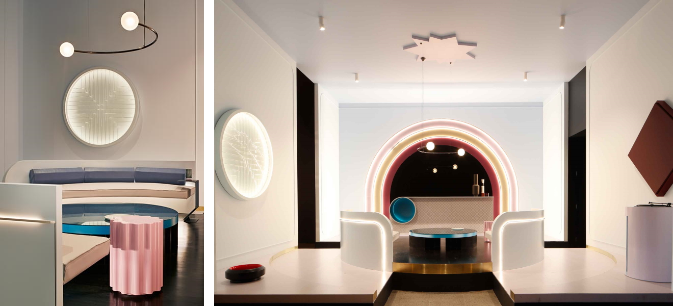
Brustman’s past work as a theatrical set designer is apparent in the way her projects typically begin, with some sort of conceptual narrative, which is gently woven and layered until the story is told through a combination of form, materiality and colour. She’s a frequent customer at her local paint shop where she’ll gather a stack of colour swatches and, upon returning to her studio, mix and match them, all the while playing with texture. The reflective qualities of different surface finishes is something she’s curious about and she pays particular attention to the way colour appears, depending on how and where it’s applied. A wonderful example of this is Inner-Terior, the gleaming art deco-inspired conceptual living space she created for the Rigg Design Prize 2018, with its artful interplay of colour, light and shadow, reflective surfaces and sculpted forms.
“I’ve always been interested in colour and drawn to environments that feature colour. I have a nostalgia for boldly hued interiors and that’s definitely driven my practice.”
Danielle Brustman – interior designer
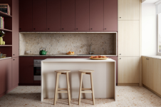
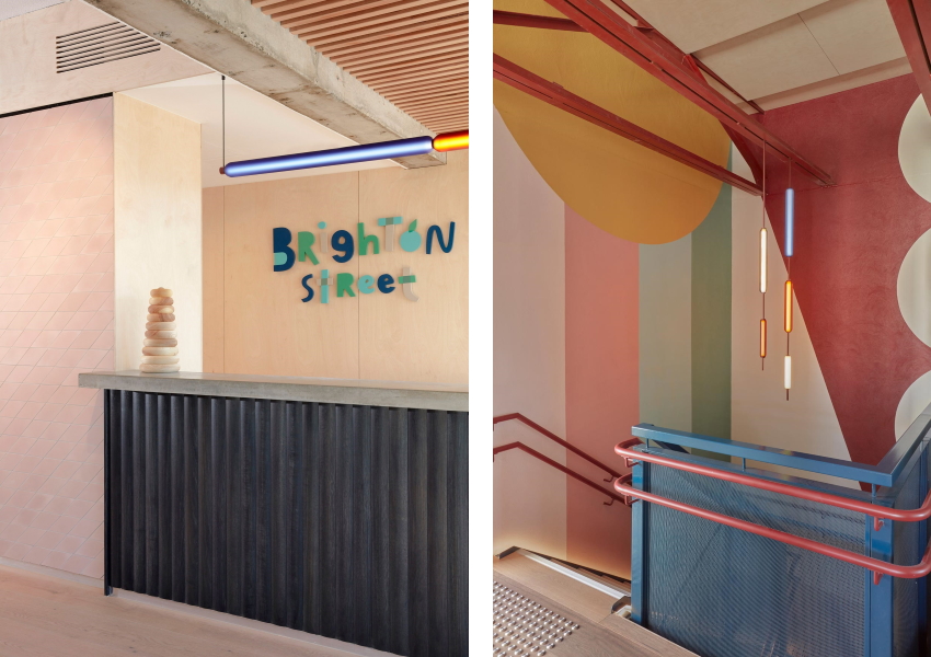
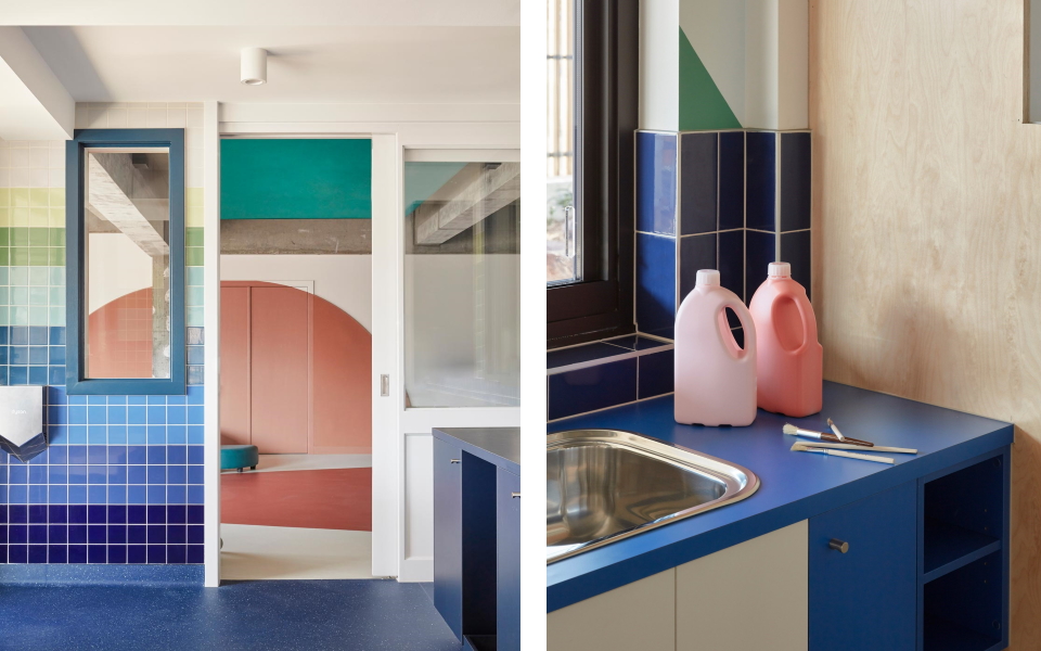
A more recent interior design, for Brighton Street Early Learning in Richmond, hums with an understated, melodic composition. “The idea here was to come up with an interior design that would entice young children, but at the same time wasn’t going to conform to the traditional use of colour in education environments, which can be harsh and garish,” explains Brustman. Each space refers back to nature – there’s a Lake Room, Cloud Room and Meadow Room – creating an overall colour palette that’s evocative of the outdoors. Laminex laminates were used for coloured joinery doors and art sink benches, and for Brustman, they pay warm homage to those laminate benchtops she grew up with. “In terms of Laminex as a contemporary product though, it’s durable, versatile and just plain incredible,” she notes. “I really enjoy the range of decors available and was pleased to discover that Laminex offers my preferred kind of colour palette.”
Revelling in the bold return of colour
Brustman cites India Mahdavi, Faye Toogood and Patricia Urquiola as key inspirations for her work, and is happy to see colour making a comeback in interior design generally. “It’s not unusual to walk into someone’s house now and it has a bright blue room. I’m really excited about the way things are moving and the way designers are being more flamboyant with colour,” she says.
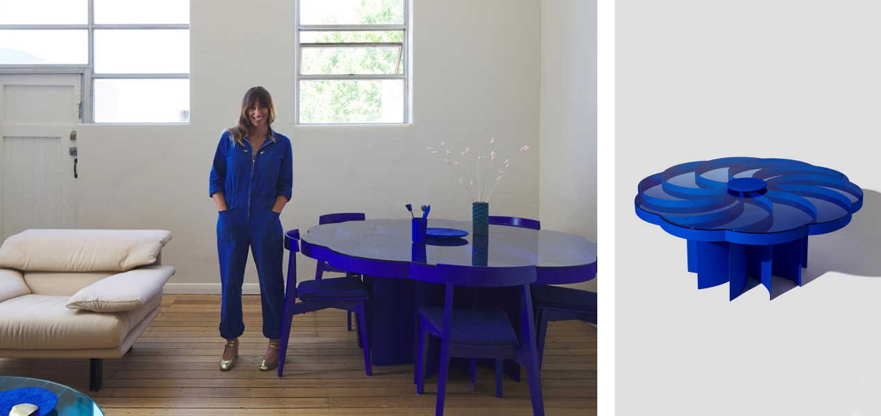
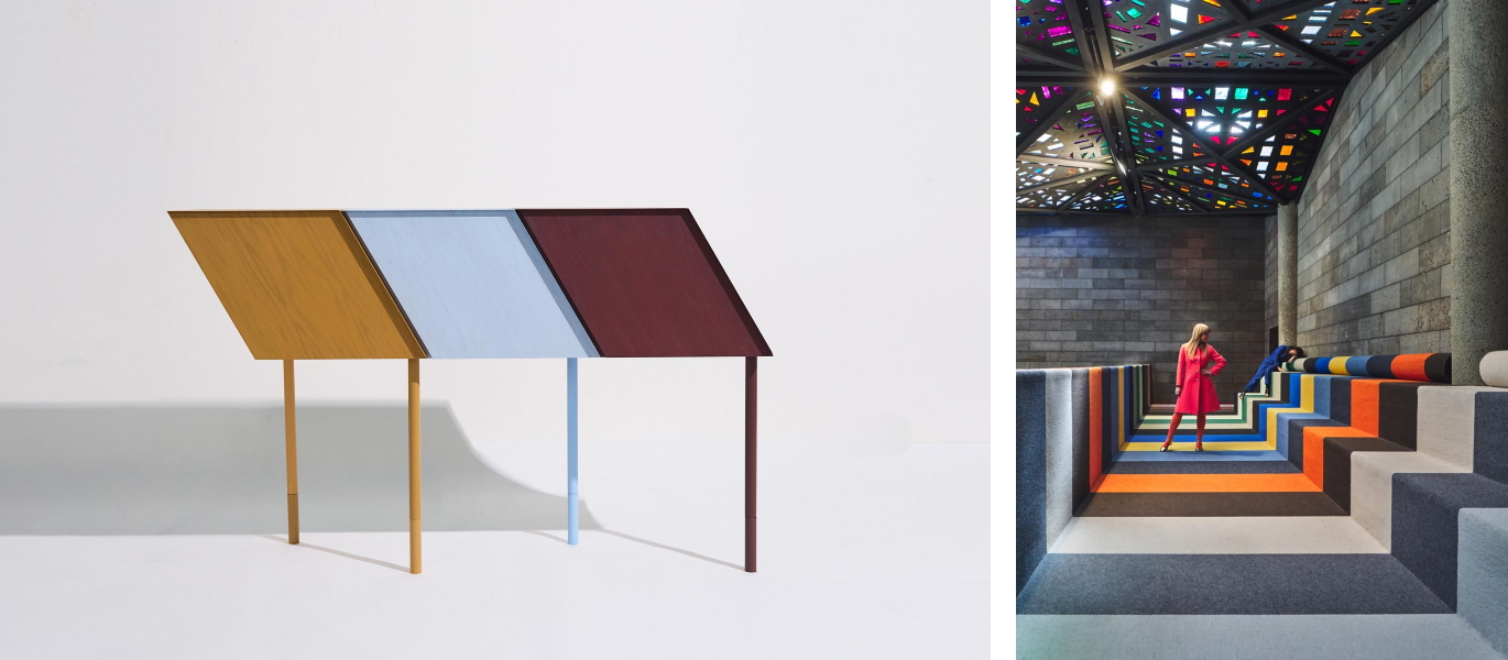
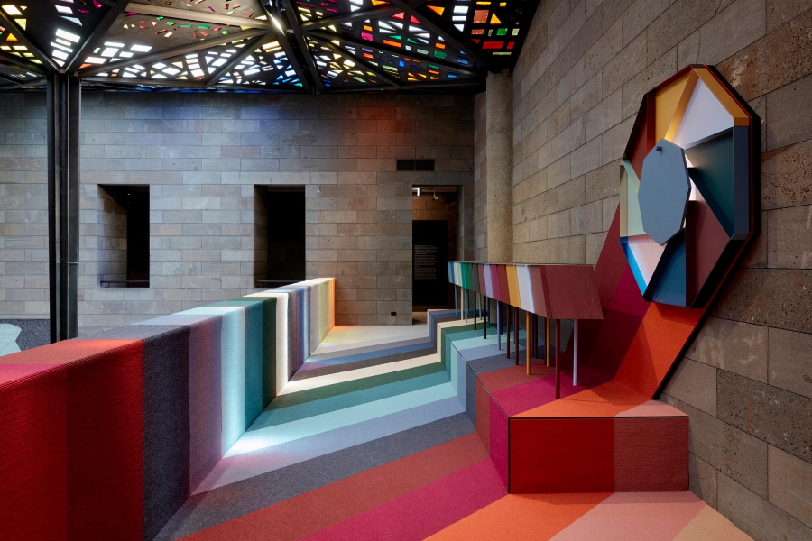
We see exactly that kind of confidence in one of her newest works, Chromatic Fantastic, an installation comprising cabinets, a wall light and “room jewellery”, currently on display in the NGV Triennial. It explores Brustman’s interest in colour and musical scales, with shapes inspired by those found in musical notation. Deep crimson, mustard and forest green sit alongside other equally rich hues, creating a sense of tension and movement. It’s an emotive piece of creativity at the intersection of art and design, beautiful and memorable, colourful and elegantly resolved. A fitting representation of her work, on a prominent cultural stage a long way from the retro interiors of her childhood!
Danielle Brustman – Interior Design Studio
Website: https://www.daniellebrustman.com/
Instagram: @daniellebrustman