The Australian Interior Design Awards give us an annual snapshot of the state ofworkplace and retail design. Here’s what this year’s program showed us.
The annual Australian Interior Design Awards (AIDA) providea moment to recognise this country’s best interior designers and architectsand, for the broader industry, a valuable opportunity to identify emerging designmovements and gauge contemporary positions on colour and texture. Laminex onceagain sponsored AIDA’s Workplace Design and Retail Design categories, and we spoketo jury member and Hassell senior associate Anthony Dickens about what there isto learn from this year’s entries.

Dialling down the colour, making the work the hero
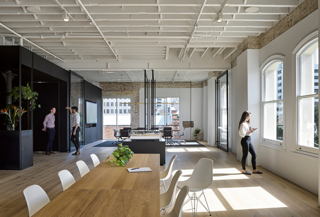
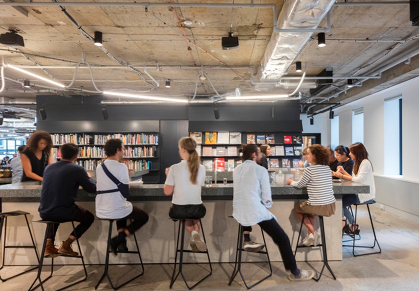
The macro trend in Australian interior design might be forbolder use of colour, but a casual glance at the commended projects in theWorkplace Design category is enough to notice something quite different. “Wesaw a lot more neutral colours than in previous years, with timbers, whites anda fair few greys coming through,” says Dickens. “That simplicity of colour andmateriality was matched by a simplicity of forms as well, and a return toreally simple approaches to how to design everything from a table to an entireworkspace.”

Pressed on what might have caused this shift, Dickenssuggests that it reflects changing ideas about how workplaces should function and,more specifically, a moderation of the activity-based working, or ABW, businessstrategy. “With ABW, the focus was on choice and diversity. There was a lot ofexperimentation with patterns, colours and curved forms, and now we’re seeing areaction to that,” says Dickens. “In these new projects, it’s not about howcolourful the sofas are, for example, or the diversity of furniture. It’s aboutthe workflows and the processes and giving people tools that support theirwork.”
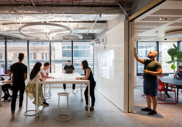
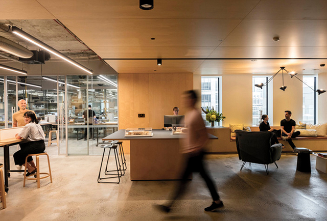
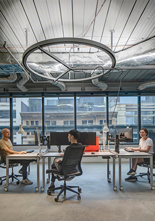
The category award winner, BVN’s fit-out for their ownSydney studio, epitomises the trend, with flexible open workspaces that promotetransparency and collaboration, and a materials palette of concrete, plywood, greysurfaces and white walls. Many of those white walls are surfaces for writing on,so teams can work through ideas together, and invite input – in essence, makingthe work the hero. This idea is explored in several of the shortlisted projects,and it’s clearly an approach better supported by neutrals and natural textures thanby a strongly coloured interior design treatment.
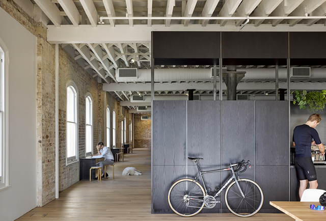
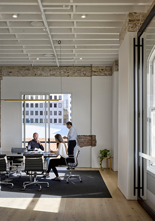
But Dickens also draws a link between the predominance ofneutrals and the way the designers worked within each project’s physicallocation. Cox Architecture’s Brisbane studio fit-out, for example, preservesand celebrates original timber, cast iron and brick elements from itsnineteenth-century industrial structure, with natural materials and neutralcolours cast in a supporting role. “Across the broad, the work seems to have areal sense of place and context,” he says. “Everything was very sympathetic tothe environment that it was in”.
Richer colours and textures creating immersive retailmoments
There was a similar respect for context shown among theprojects in the Retail Design category. But one of the fundamental differencesbetween designing for retail and the workplace is the immediate impact a retailfit-out needs to have on the people who come into that space – it needs to workharder, quicker. Perhaps this is why the shortlisted retail projects reflectedmore of the trend towards strong colour in interiors, with the designersseeking to create richer, more immersive environments. “We definitely saw a strongerplay on colour in the retail category,” says Dickens, “as well as texture andmetallics.”
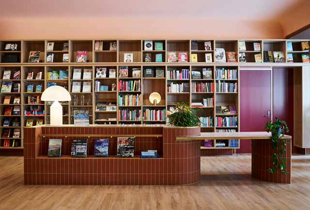
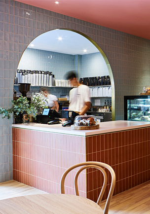
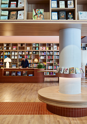
SJB’s design for the UNSW Bookshop, which received acommendation in the category, enlivens natural timber flooring and joinery withvarious shades of pink and blue, expressed through tiling, painted surfaces andfurniture.
Another commended project, StylecraftHOME Melbourne byHassell, combines rich green and blue accents with copper-clad archways and agolden stairway, to create an effect perhaps best described as “industrialluxe”. It’s the kind of interior you step into and stop for a moment, to takeit all in!
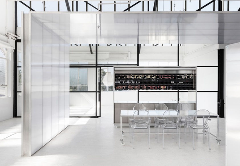

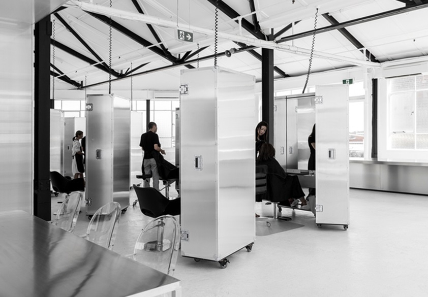
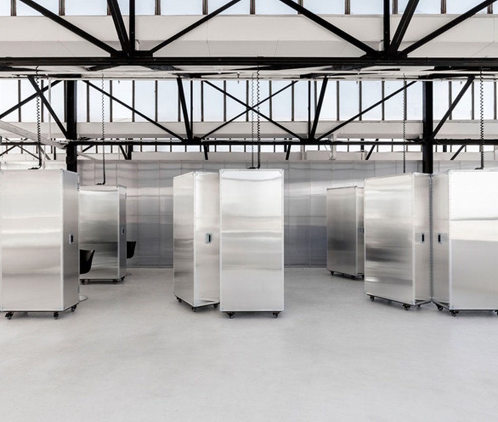
If Usfin bucks the retail colour trend, its design rationaleis consistent with the best of the projects entered in this category. AsDickens notes, “The retail sector is competitive and these projects prove thatcreating an aligned memorable experience is paramount to ensuring a brand has aclear voice.” It’s just that for most retail designers this year, creating thatexperience meant being quite colourful; for one, a commitment to being colourless!
