
An iconic business operating out of an equally iconic building finds itself at a new site with the rare opportunity to reinvent itself after 105 years.
The Leonard Joel Auctions Rooms and Gallery is something of a fixture for many collectors, designers and decorators in Melbourne. Till recently, it was located in an old school in Malvern - full of charm and old-school character. Leonard Joel has been the go-to location for fantastic finds, weird and wonderful trinkets and tchotchkes, furniture and, of course, incredible art for more than a century.
Auctions are held frequently and can feature anything from themed collections - say a mid-century art collection of varying sources - the entirety of a deceased estate, or at the highest end, extraordinary art and design from around the world. Then there’s everything else in between, from individuals looking to sell jewellery to those looking to move valuable antique furniture. With their new site providing the opportunity to reposition the business, the brief for their design team was to reimagine the space for their brand as a progressive, sophisticated auction house, while maintaining a strong sense of history and tradition.
“We watched the space function,” says Mardi Doherty, Director of Studio Doherty, the interior design studio charged with the responsibility of creating a space that caters to both the aesthetic and functional needs of a business, and its clients, which would allow them to present art and rarities at the highest level. “It’s incredibly fast paced and needs flexibility and durability to accommodate the constant movement and change inherent in auction house operations.”
Compared with the old school, the new space, from the outside, is not quite the same. “It was built in the early 2000s. It was basically a big two-story box… quite uninspiring architecture,” explains Mardi, “but for us it was about recognising that Leonard Joel has this amazing 105-year heritage, and also has a progressive future ahead of it.”
With this in mind, Studio Doherty pushed the firm towards a design that would generate new clients and a younger clientele, reinforcing the sophistication while maintaining the air of heritage and quality it was known for.
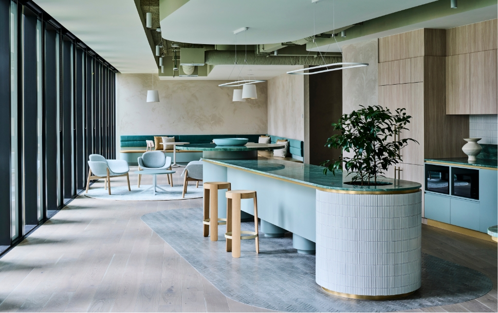
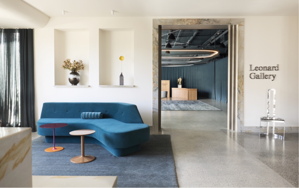
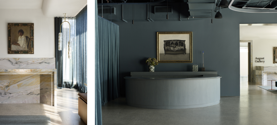
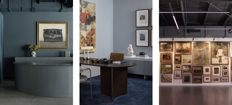
Moody was the key takeaway from the client’s brief and would hint at the palette to come. A signature colour began to fill the space, one that would carry all these characteristics. Deep, black-based, navy blue brings a club-like quality to the space, elevated by several materials that add texture and bring intricate details, something of a Studio Doherty touch.
An amazing stone from Victoria Stone Gallery is one of them. Aquarella Gold was used on the front desk and foyer and features “sweeping gold and blue veins on a white quartz background” looking as though it was made for the space.
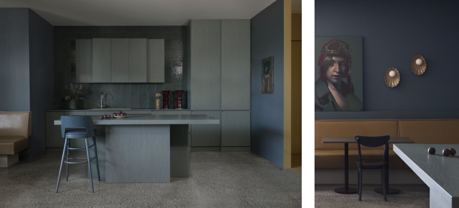
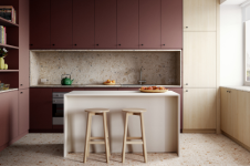
The second prominent addition is the use of Laminex Smoked Birchply, a smoky, grey based plywood woodgrain, that appropriately brings a moody hue. Studio Doherty and their recent collaboration with Laminex featured the décor extensively in their Scoop Kitchen, albeit in a poppy, bright, multi-coloured context.
“It was something of a departure for us, and not how we normally work. We’re about bringing lightness and brightness to a space, and this was very different. The interiors had to be quite recessive, so the products could be the hero, rather than the design or joinery or furniture,” explains Mardi.
While this moodiness and dark, sombre approach is as Mardi says, a departure for the studio, one can’t help but feel that it’s in these moments wonderful things can happen. A studio such as this, known for their gregarious, Mid-century influenced and playful interiors is just the team to tackle such a project. Studio Doherty subverts expectations while providing everything the brief asks for, letting the art, designs and collectables take the spotlight while exhibiting tact, control and elegance.
The auction house is constantly in motion, with people, cars and trucks forever accessing the space. Large scale items are moved into place, prepared for display and readied for sale.
“We needed to think in design terms other than the aesthetic,” says Mardi, “functionality is the heart of their business and the word robust was repeatedly mentioned, and we were like, yeah, everyone says this, but then we saw it. They meant it!”
Hand in hand with functionality comes flexibility. Sales at Leonard Joel can be a few as 10 or 12 pieces, but immediately jump to 100 the day after, so being able to move walls and create new spaces was extremely important. Walls on casters were built and an amazing 30-metre-long curtain was hung to divide the space when necessary.
“Take your fun seriously,” Charles Eames once said and detailing throughout is quintessential Studio Doherty; subtle and applied surreptitiously, exhibiting their playfulness and approach to design perfectly. Aquarelle Quartzite is used to border the entrance of a gallery, never once out of step with the theme, but a wry wink and nod to the fun a studio such as this has with materials and colour.
The new Leonard Joel Auction Rooms and Gallery has leant into its 105-year-old history by embracing its sense of history, but rather than producing a stuffy, old club, Studio Doherty have managed to provide the seriousness they want, with the fun they need. Projects like this reveal the fleeting nature of our lives, and how we are just custodians of this time, hoping to pass on something of value and worth to the next generation. Studio Doherty’s work may be just a moment in a century of history, but it’s a moment worth remembering.
Learn more about this project and explore Studio Doherty’s portfolio in more detail here.
Credits:
Interior Design: Studio Doherty
Architecture: Stoll Architecture
Photographer: Prue Ruscoe
Stylist: Bea Lambos
Builder: Cubo Constructions.
Joinery: Evolve Interiors.
You might also like