
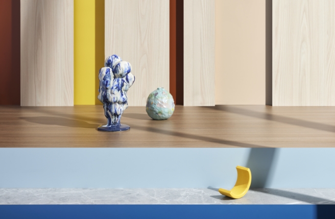
Find harmony and balance in the juxtaposing colours and hues of Energised Contrast. Play with pop and saturated brights to create palettes and rooms that uplift and inspire.
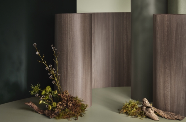
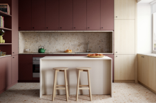
Create contemporary interiors that entertain and defy expectations. Tempered by nature, every colour in the range is bright, yet workable by design. Laminex Golden Wattle or Laminex Fresh Spring burst with energy but used alongside Woodgrain – even multiple woodgrains – the potential of the range becomes evident; this is about composition and compelling storytelling. Use in conjunction with creative patterns of mixed stone and timber combinations that echo classic fashion mismatched styling.
Looking towards the Care Culture trend of post COVID, Energised Contrast uses colour to support and improve consumers’ overall wellbeing, by providing uplifting and refreshing colour blocking and colourways.
Not just poppy colour, this range uses stone and woodgrains to complete the effect. Consider the possibility of cabinetry interiors and facing panels in Laminex Portsea or Laminex Moroccan Clay while façades of Laminex Milkwood and Laminex Danish Walnut hide the coloured secrets within. This is your chance to create a world like no other, challenge the status quo and inspire every day.
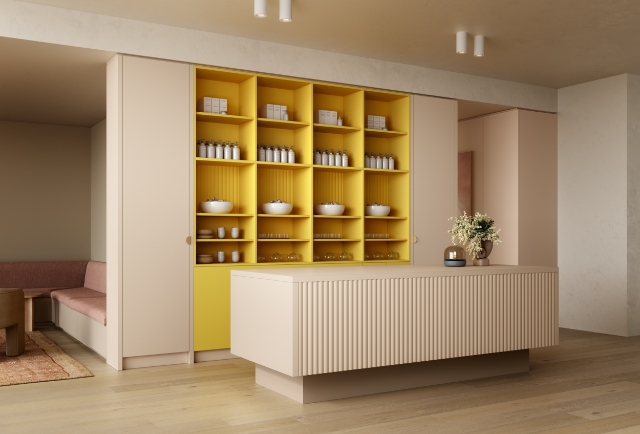
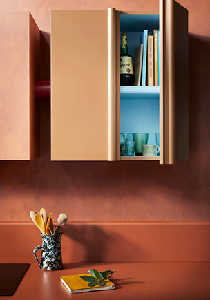
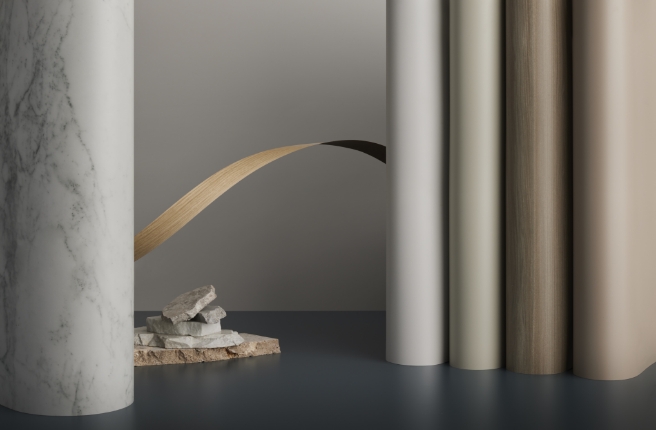
Laminex Golden Wattle, Peruvian Clay and Porcelain Blush | Laminex Danish Walnut, Milkwood and Pillarbox. Design by YSG Studio. Photography by Derek Swalwell. | Laminex Portsea, Moroccan Clay and Laminex Marmor Girgio TrueScale. | Laminex Burnt Ochre, Moroccan Clay and Fresh Spring. Design by YSG Studio. Photography by Derek Swalwell.
The Palette

Laminex
Moroccan Clay

Laminex
Fresh Spring
Laminex
Marmor Grigio TrueScale
Laminex
Porcelain Blush
Portsea
Laminex
Danish Walnut
Laminex
Golden Wattle
Laminex
Milkwood
You might also like