
To celebrate the launch of the Laminex Landscape Series, we asked Daniel Lane, Iva Foschia and Karen Batchelor to tell us how the natural environment inspires their buildings and interior designs.
The influence of site and context is fundamental to any building project, but the influence of landscape is something quite different. Here, architects Daniel Lane and Iva Foschia and interior designer Karen Batchelor talk about the landscapes they know and love, and how their influence plays out in their work.
Daniel Lane from Preston Lane Architects
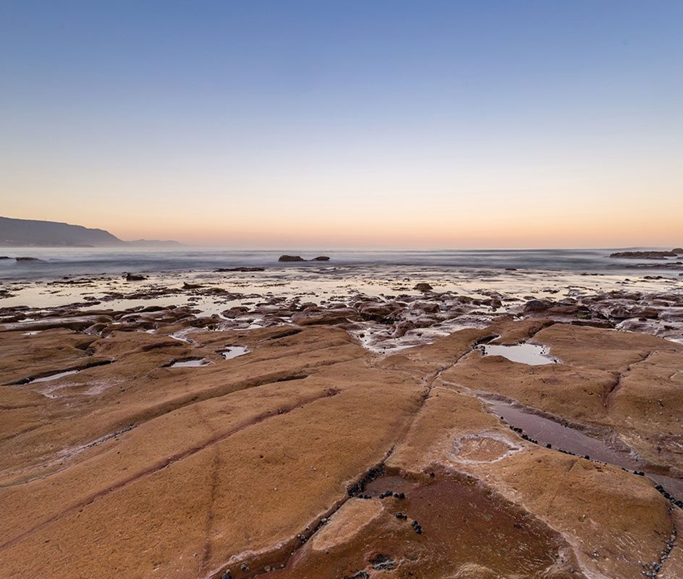
Hobart is quite hilly, and we’re often looking up towards Mt Wellington. You see these shades of colour, almost like silhouettes of the hills, that start with green and go all the way to purple. We see that a lot in nature where everything tends to blend together in fairly muted tones, whether it’s your greens or browns or blues or yellows. Then you might get that one pop of colour that’s a little different to the rest. We try to do that with our colours, work with shades rather than distinctly different colours, and there might be one that pops a little bit more.
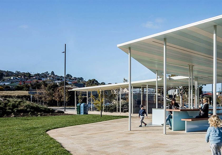
The Kangaroo Bay Pavilion is a good example. It’s down at the waterfront, there’s the mountain in the distance, there’s an oval and a parkland. The pavilion is coloured in striped sections that are essentially shades of white, but each has been given an undertone of yellow or green or blue. It’s a reflection of the landscape, but that natural, muted approach also made sense because there was so much going on within the waterfront context.
But every site is different. Whether we’re near the water, in the bush, wherever, the influence of the landscape is unique. There’s a residential project of ours in West Hobart that has spectacular views, so we decided to limit the internal colour palette to whites and blacks and timber finishes. It means that, when you’re looking out over the water, that’s what draws your eye. Or back in the other direction, it’s the mountain, and what’s happening inside doesn’t distract from that. In this case, the interior is designed to draw the landscape into the home, rather than emulate it through applied colour.
Iva Foschia from IF Architecture
The influence of the Australian landscape on our work is most prevalent in the restaurants we’ve designed, and particularly at Attica. The story we created there is about the regeneration of the Victorian bush through fire, how the eucalypts germinate and spring back to life.
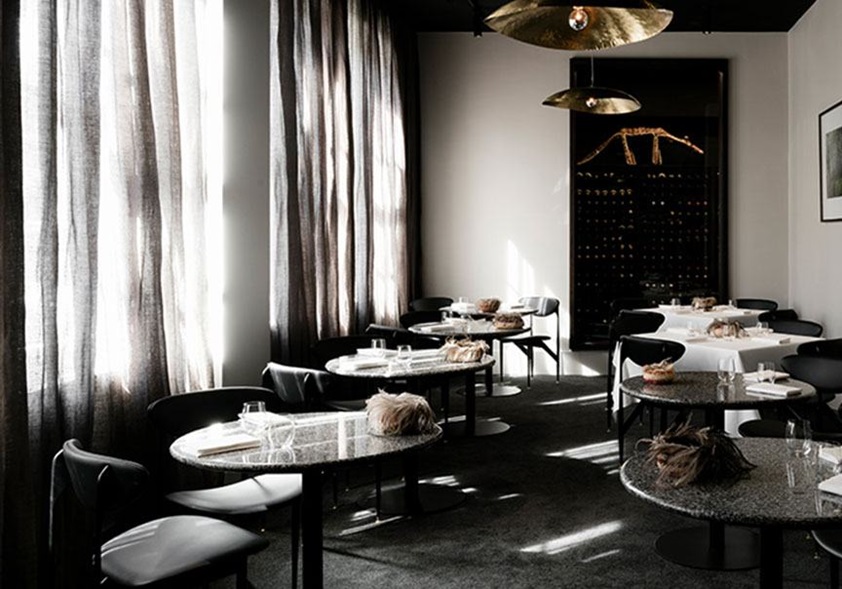
On the walls, there are beautiful photographs showing a charred and burnt landscape, and then that turning to new growth. The restaurant interior is designed to evoke that environment. The Victorian granite tabletops are grey and white and ashy, and the curtains have a copper thread in a darker base, so when the light comes through you get this smoky effect with hints of red. In the private dining room, the walls are clad in timber that’s been charred to black using the Japanese technique of shō sugi ban.
Then when you see the food on the table, it’s vibrant. It’s the new life. There’s a dish that they do with the greenest, most beautiful leaves from their garden, and it gives this wonderful contrast against the interior. So the regeneration through fire happens when the food arrives at the table. The story comes full circle, and it’s all represented through colour and texture.
But Attica’s is just one story. If you’re in a bushy Sydney landscape, it’s quite different to what we have around Melbourne. Driving south from Perth on holiday, I was captivated by the red dirt along the side of the road. There are so many different Australian landscapes and they can inspire architecture and design in many ways.
Karen Batchelor from Matt Gibson Architecture + Design
We love colour in this office but I’m always conscious of colours being trend driven, and the risk of certain colours tying a project to a particular moment. So I tend to not use strong colour where it’s going to be difficult for our clients to change, unless it’s one of those classic earthy landscape colours, which I think tend to stand the test of time. When we do use brighter colours, it’s through artwork and key pieces of furniture, and with bright paint finishes. We always put a little drop of grey into them because it takes the glare away and means that they’ll sit more softly against natural materials.
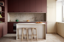
In some ways, it’s the texture of the Australian landscape rather than the colours that influence us. For instance, often when you look at native Australian plants, you see a range of different textures and tones within a fairly narrow grey-green-blue colour palette. And you see that kind of thinking in a lot of our work. In Melbourne it might be combinations of brick, blackbutt timber and tan leather, all similar colours but with different textures. Whereas in Sydney, we take inspiration from sandstone, pale oak timbers, linens and wools, a lighter palette. So our influences tend to stem from the particular natural environment around us.
But the influence of the Australian landscape can be more conceptual, too. I was recently describing to a client how we can use architectural timber on the outside of a house and it fades into beautiful grey tones where it’s exposed to the elements, while the timber finishes on indoor surfaces are designed to retain their hue, their richness. So the house ends up referencing a eucalyptus tree where the pale, weathered bark peels away to reveal the rich colour inside.
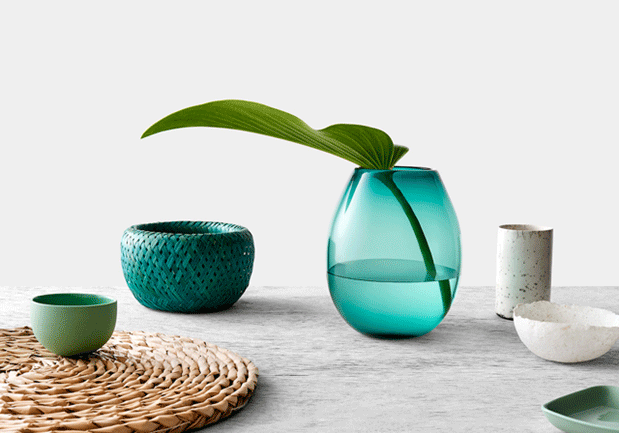
The Laminex Landscape Series is available now. Find out more or download a brochure.